Colorblind Settings are an Antipattern
As a colorblind person (deuteranomaly), I've found the worst part of the condition isn't anything to do with having trouble with certain colors. Sure, it might be hard to tell when beef is fully cooked, or whether clothes match, but I have a thermometer and don't care much about fashion. I'm sure for more extreme cases like monochromacy it does become a daily issue, but those cases are luckily extremely rare.
Instead, the worst part of it is people misunderstanding the problem.
This is most apparent when I find (and try to use) colorblind options in accessibility menus. There are a few different "forms" a colorblindness setting might take, and they all require some incorrect or harmful assumption, usually that color is a good primary channel of information.
The "Mislabeled Simulation" Setting
This is, admittedly, the least anti-"pattern" of the options, and is more of an awkward mistake. This type of setting is one labeled as though it's an accessibility feature intended for end users to help compensate for color deficiency, when it is actually simulating what colors look like for various kinds of colorblindness.
Here's one of these settings, found in Android (Samsung phone, Settings → Accessibility → Visibility Enhancements → Color adjustment; unfortunately the setting doesn't get captured in a screencap):
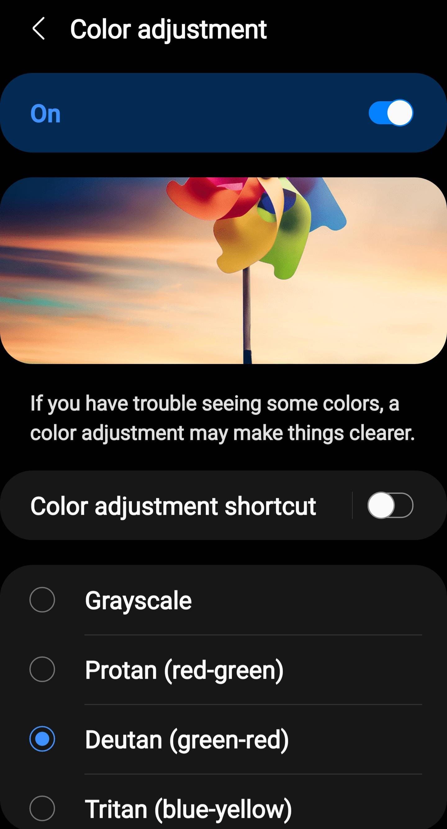
The first and most obvious issue is that this is plain misleading. It even misled me previously: many years ago I turned on a similar setting on my Moto G4 phone, saw no changes, until a few months later when someone glanced at my screen and asked me why the YouTube logo was green. This is at best annoying, and at worst makes people believe solving colorblindness is as simple as changing a setting (I'm aware of Daltonization, more details in a later section).
That problem can be solved by both making it clear it's a simulation and/or limiting it's availability to designers, developers, and artists by putting it only in creative applications such as Photoshop or Figma. This isn't much of an antipattern of its own, however if you're concerned enough about your palette enough to want this feature for testing, I have concerns that your visual design isn't making enough non-color distinctions.
The "just use shapes/text/etc. lol" Setting
This type of setting is one that changes various UI elements that primarily communicate meaning through color and adds supplemental indicators that don't rely on color. One example of this is in FTL: Faster than Light, where it is used for the sector map (click to show just the image):
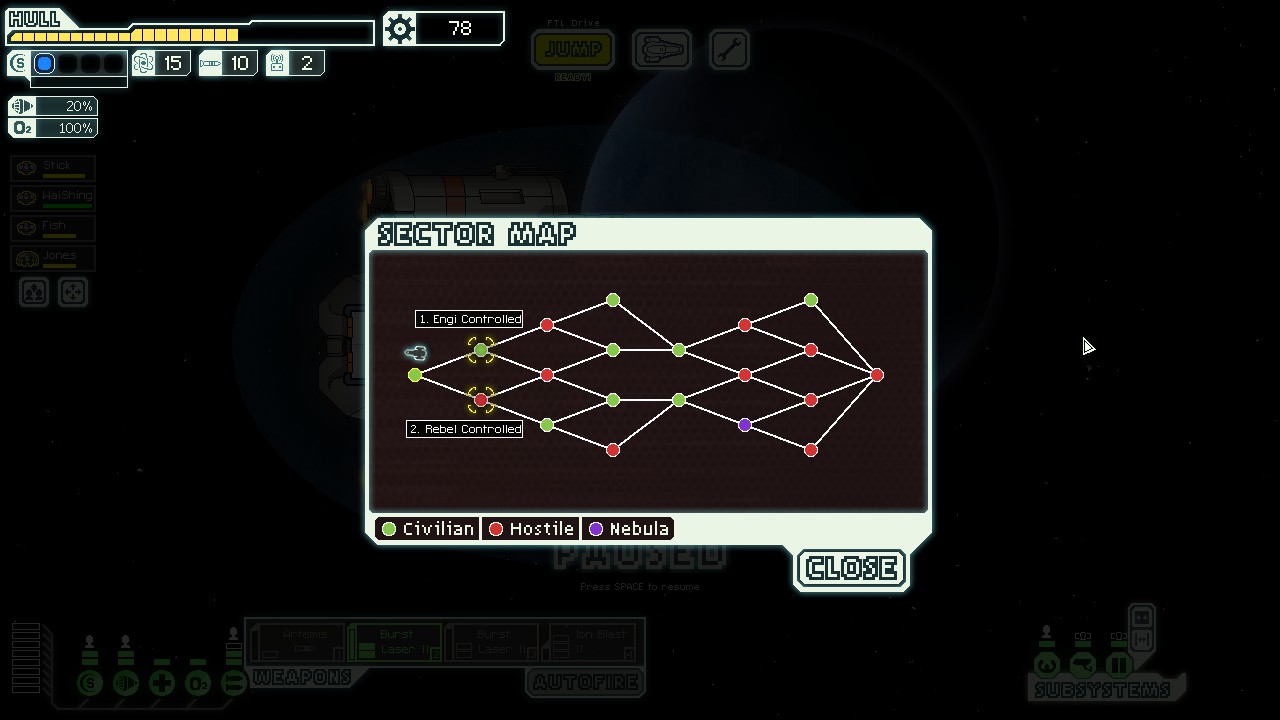 Disabled
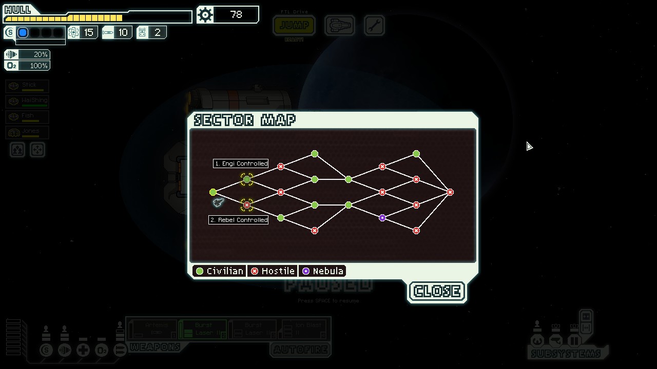 Enabled
Here the color of the icons is used to indicate in broad strokes what the player can expect for a particular sector, and the colorblind mode adds an × for hostile sectors and a · for nebula sectors. This is actually a pretty nice feature, and while the original color choices were already fairly distinguishable even to my eyes (the red is notably darker than the green, and the blue is even darker), this is an excellent example of the ideal way to accommodate colorblindness.
Except for one thing: Why is this a setting?
The inclusion of symbols for these nodes makes it easier to get the important information at a glance whether you can tell the colors or not. It's harder to mistake the what each sector holds because the symbols provide redundancy. Additionally, the clever lack of symbols for civilian sectors means high visual noise for a part of the map is a proxy for danger. Who would want this setting disabled, outside of pure aesthetics? This setting makes more sense just being the way these nodes look by default.
The "Musical Chairs" Setting
This setting is one where you change all of the colors in your design to avoid potentially confusing color pairs. This can either take the form of manually picking different colors, or systematically shifting hues like what Daltonization provides. A good example of this can be found here.
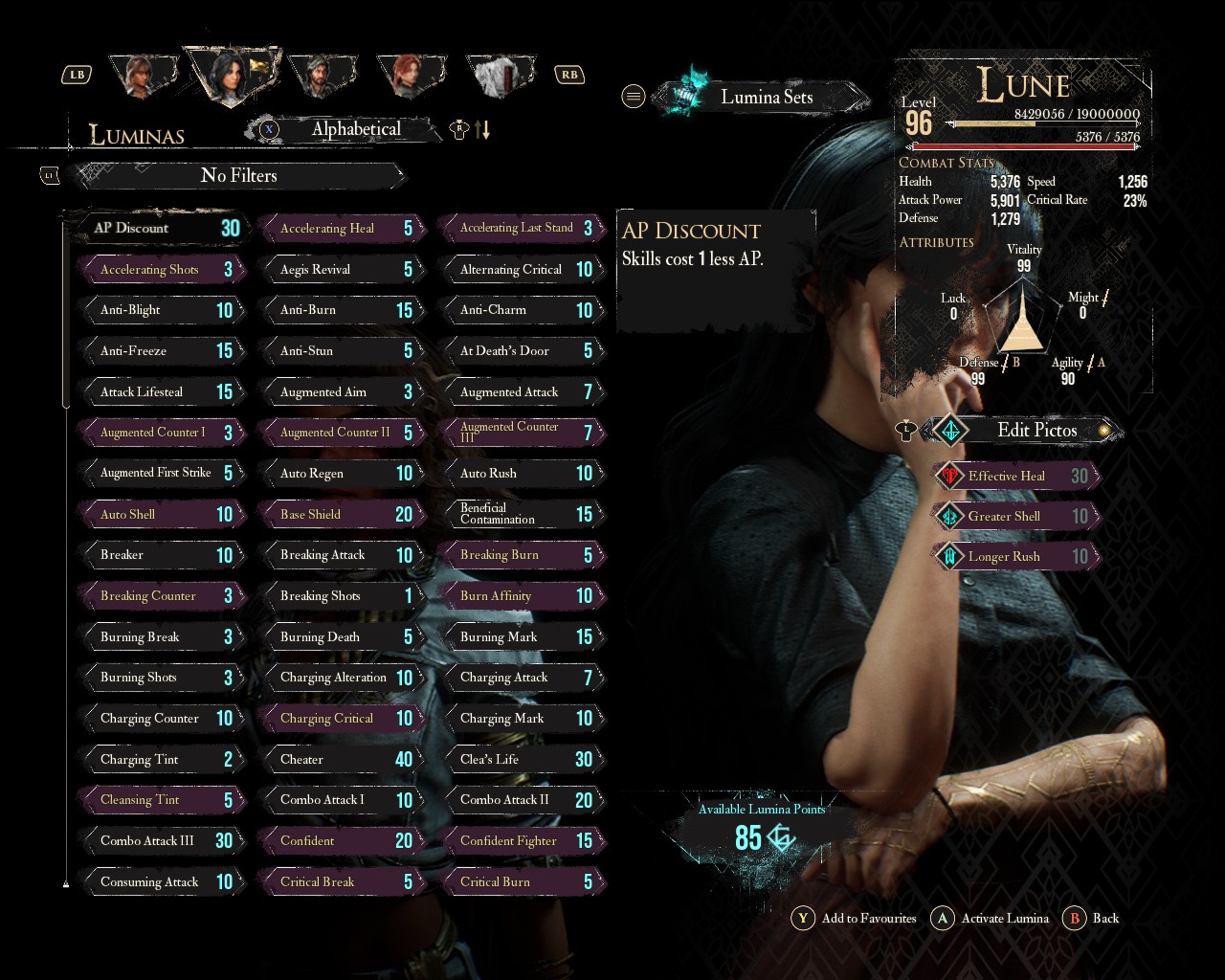
One example of this applied to the GUI can be seen in Clair Obscur: Expedition 33:
 Disabled
 Enabled, Deuteranomaly, 100% strength
This can, admittedly, be potentially useful, but only as a stopgap for poor color choices elsewhere. If a site, program, document, or game chooses the same shade of red and green to communicate, a filter like this applied after the fact can make a difference, although luckily I haven't encountered the need myself.
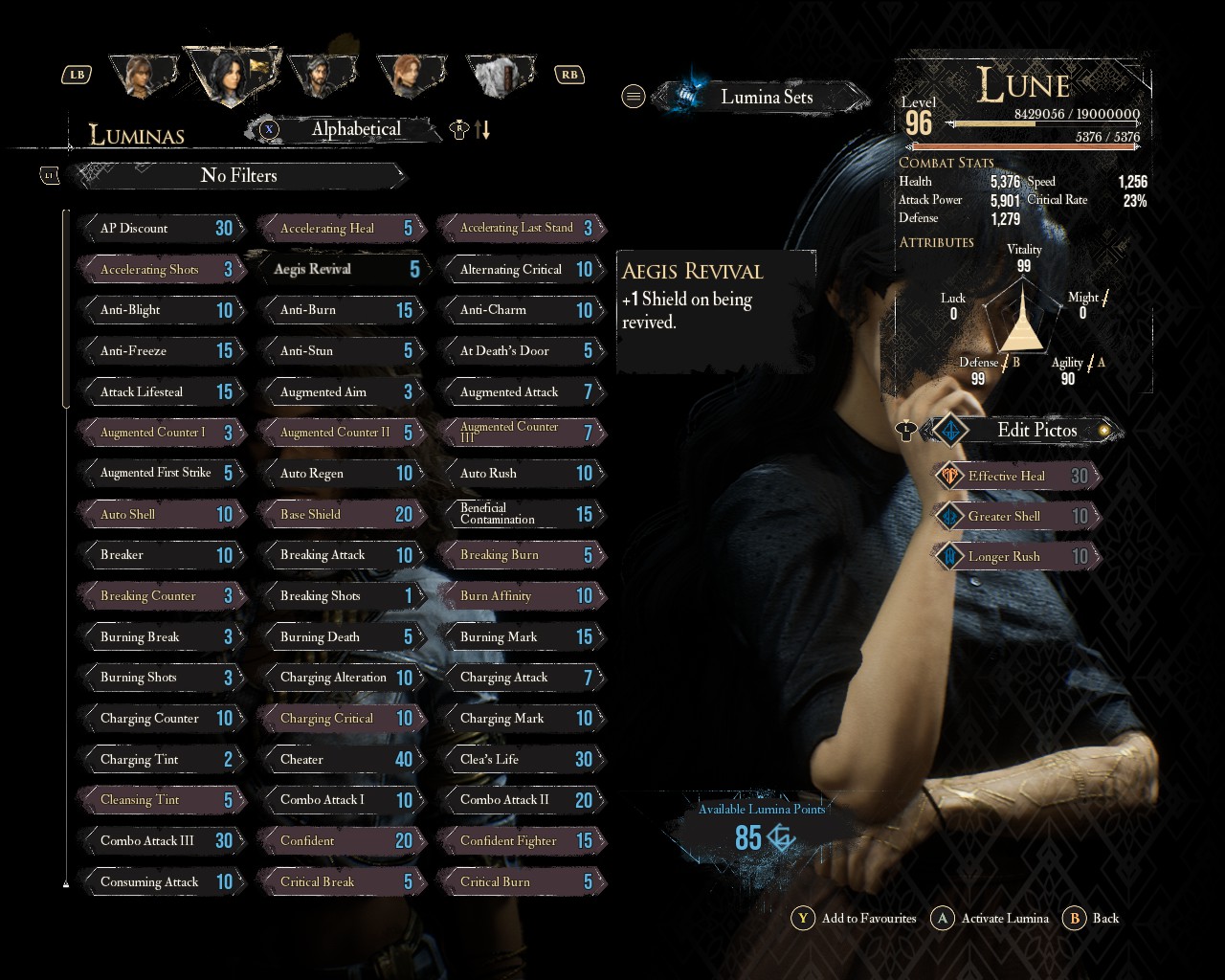
Therein lies the issue, however: the need for this feature, especially at an application level, implies someone somewhere is using color as a primary information channel, and decided to use two potentially similar colors. The above Expedition 33 example has this issue: having a Lumina equipped without the setting is only shown by transforming the text from white to yellow and the background from grey to a pale cyan(?), both very subtle color changes. If they gave equipped Luminas some additional non-color indication, like how the current selected Lumina has a particle effect surrounding it, that would alleviate the need for a colorblind setting for this menu entirely.
There are occasions where using only color may seem forced, such as a heatmap, however saturation and value are as modulable as hue with fewer colorblindness concerns. If, say, you wanted to show rates of alcoholism by county, it wouldn't make much sense to distribute a "normal" red-green colored one and an "accessible" red-blue colored one. A better solution in that case is to use dark red and bright green (or vice versa) generally, which keeps the original implications of the color while also being easy to read with poor color vision.
That gets to another potential issue with shifting colors around is that each color already has reified meanings. In other words, red can imply blood or anger, green can imply life, etc., and by changing the color, those implications can be left behind. Expedition 33 by virtue of its story-based nature can be very sensitive to this (in particular the petals), but luckily the developers appear clever enough to have applied the colorblind filter only to specific, non-important objects in the environment like hair and foliage. While I do commend that effort, it doesn't feel worth it as most colorblind challenges appear in the GUI anyways.
So How am I Supposed to Accommodate Colorblindness?
Most important thing: remember that color is a supplemental information channel and not a primary one. Shapes, icons, or if prominent enough text, are much more reliable for showing the user application state. The point of color in these contexts is to reinforce the already present information.
The toggle on the left only shows its enabled/disabled state via color, as well as its hover state. The right toggle adds a circle that changes appearance on hover and a ✓ or × to show its enabled state. Usually, like in this example, adding shapes and symbols comes without having to lose color, which makes it a no-brainer.
In situations where you do find yourself using color, try to also change brightness as well. Brightness is very easy to distinguish no matter the user's type of colorblindness. Even if the color is purely supplemental, this can reintroduce the benefits like glanceability to those users.
| Memo | Debit | Credit |
|---|---|---|
| Bought watch | $100.00 | |
| Sold butter knife | $2.50 | |
| Sold watch | $90.00 |
| Memo | Debit | Credit |
|---|---|---|
| Bought watch | $100.00 | |
| Sold butter knife | $2.50 | |
| Sold watch | $90.00 |
The above tables get usage out of the intuition that red means loss and green means gain. However, the first one has a similar brightness level between the two, which makes the difference in color difficult to notice at a glance, especially for color deficient users. The latter keeps the hue and saturation the same but gives them significantly different brightnesses to call attention to the color difference.
If you find yourself wanting or needing a special colorblind setting, consider asking yourself where in your application it would help. If it's at all in your control, consider fixing that accessibility issue at the source.